Spring City Tennessee Rebrand
2021
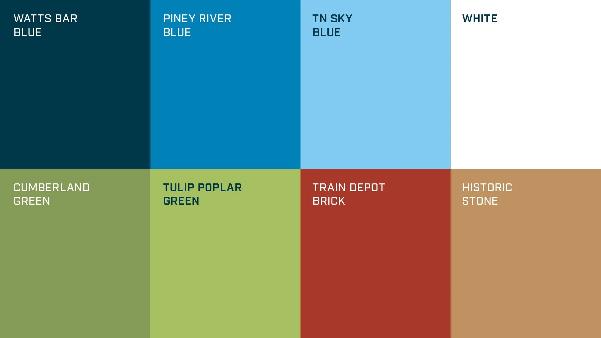
The Town of Spring City, Tennessee approached me about rebranding their unique community as more than just a small town between Chattanooga and Knoxville but as a thriving fishing and outdoor destination. With the Cumberland Mountains in its back yard and the Piney River flowing into Watts Bar Lake, Spring City is a center piece for the outdoor enthusiast!
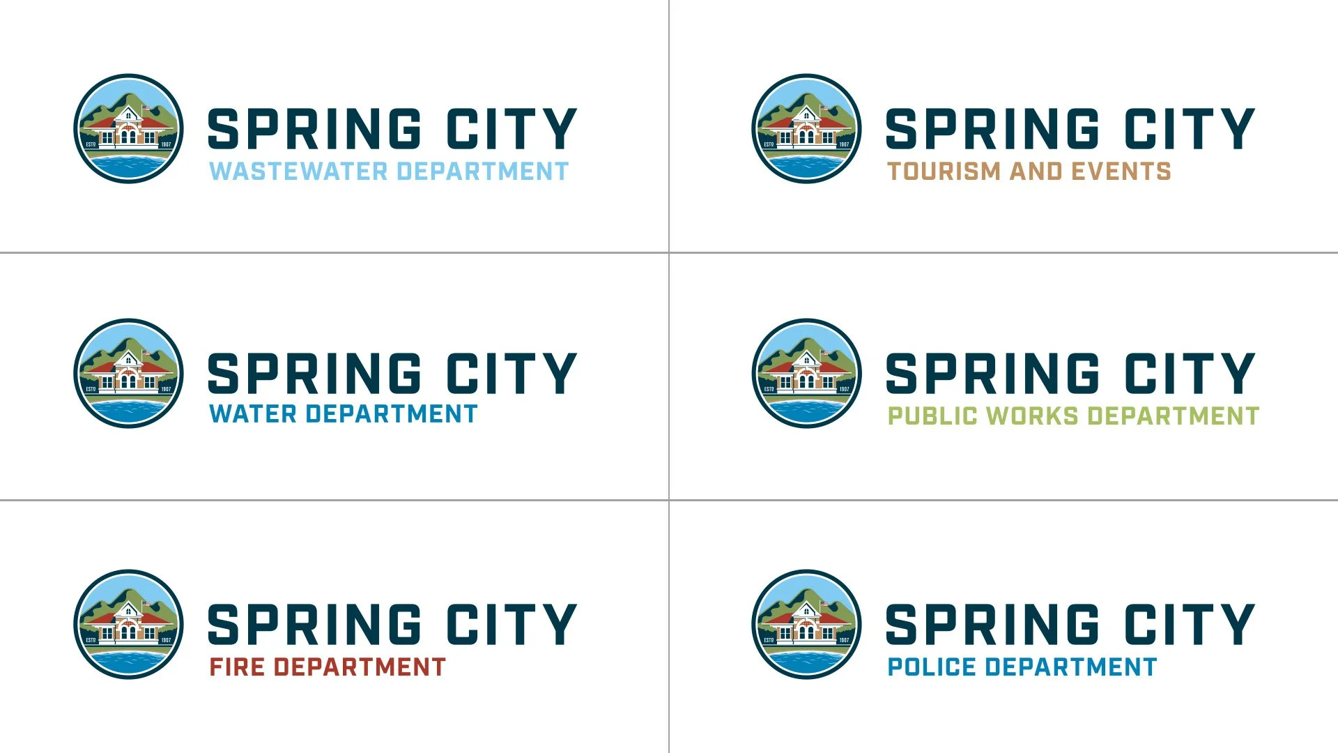
The main identity serves as the town seal and visual anchor for the various city departments and utilities. I was also tasked with creating separate logos to promote Spring City as a sport fishing destination as well as a Visit Spring City to promote the town’s chamber of commerce.
Services
Branding, Logo Designs, Illustration
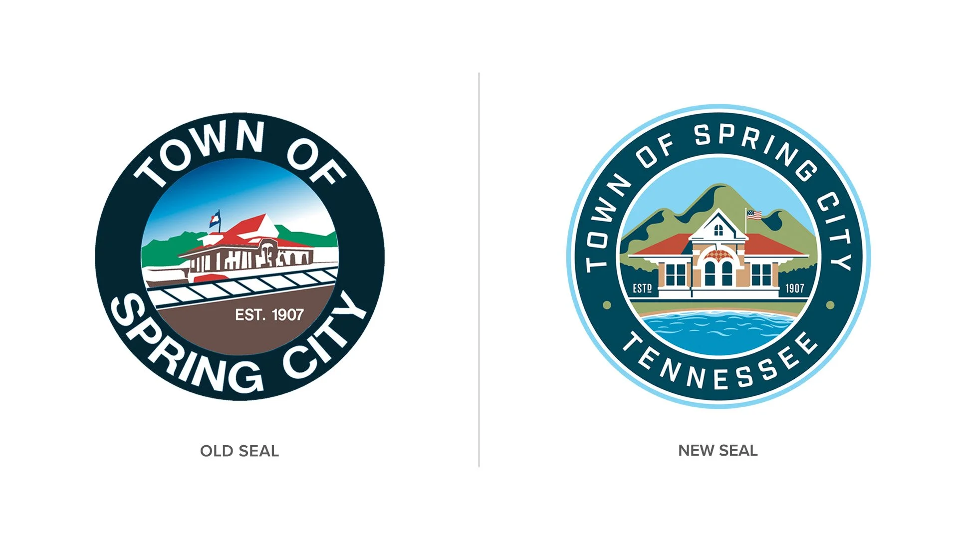
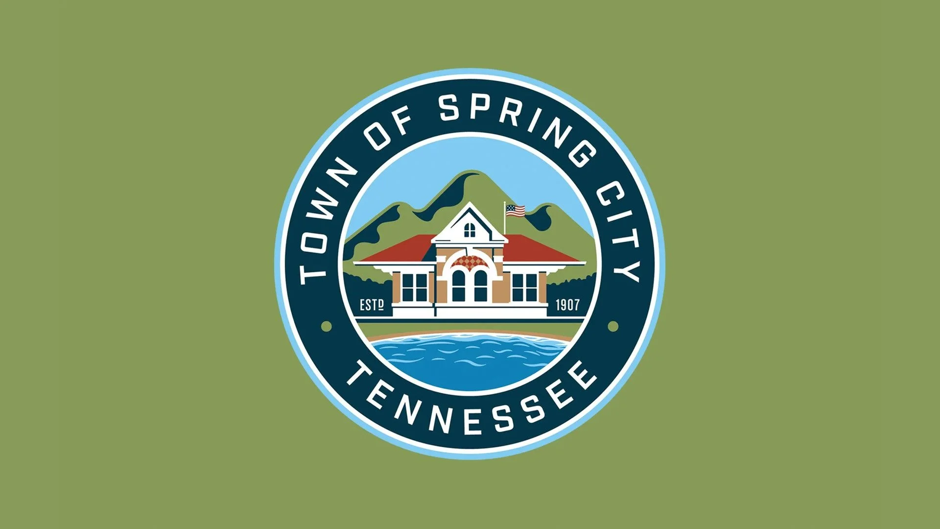
The Seal Details
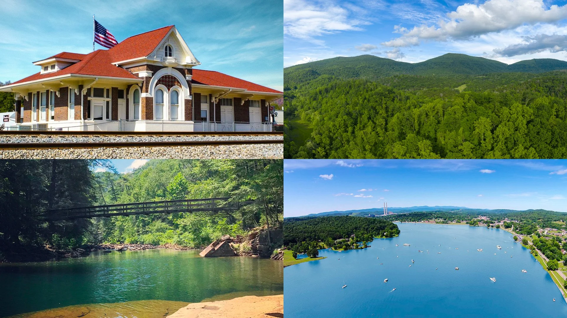
The Historic Train Depot
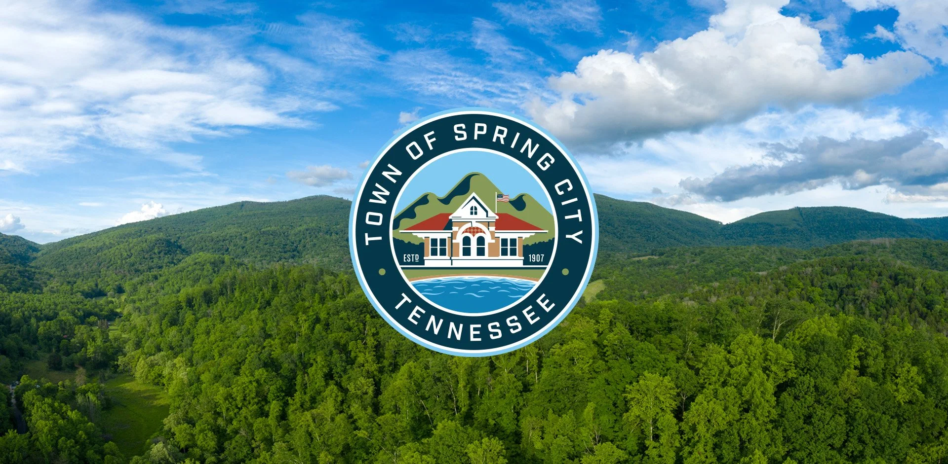
Used in the current Spring City seal, this historic landmark has been with the town since 1909 and is currently main office for the Chamber of Commerce and also serves as a museum. Spring City was also a thriving railroad shipping hub during the late 19th centuries.
The Cumberland Mountains
The Cumberland Mountains serve as a backdrop to the West of Spring City and represents all of the outdoor activities close to town such as hiking, mountain biking, rock climbing and bird watching.
Watts Bar Lake & Piney River
The water waves in the town seal represent all of the water activities around the Town of Spring City — from professional bass fishing, recreational boating, kayaking and much more.
The Town Logo
Visit Spring City Logos
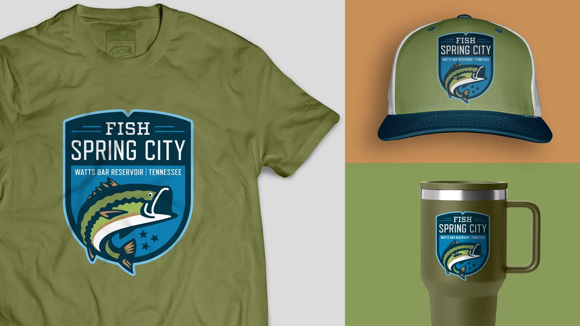
Fish Spring City Logos